Menu dynamics
Anchors and extremes
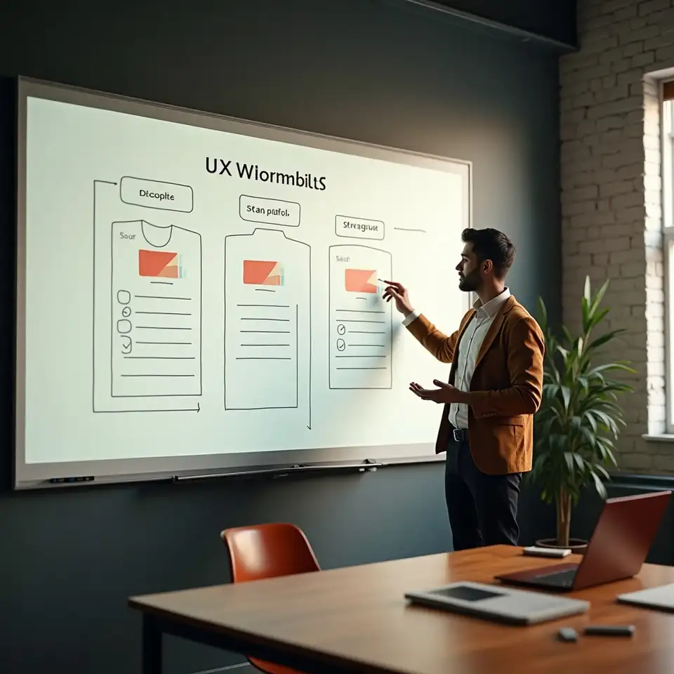
In multi tier menus, the highest tier can act as an anchor that makes others look modest. Niageatveswi checks whether this visual anchor reflects a realistic choice for most users or simply inflates perceived value lower down. When misaligned, the team explores alternative framing that still communicates range without distorting expectations.
Specialised options
Some options exist mainly to meet regulatory or legacy requirements. Niageatveswi assesses whether these should remain equally salient or be clearly marked as specialised, reducing confusion for the majority while keeping access for those who need them.
Campaign leftovers
Temporary campaigns can skew salience for months after they end, as banners and badges linger. Niageatveswi encourages teams to treat such cues as time bound, with clear plans for review and removal so that yesterday’s priorities do not quietly dominate today’s decisions.
Internal realities
Behind every menu sits a set of internal constraints: capacity, risk appetite, and operational ease. Niageatveswi facilitates conversations that reconcile these realities with user needs, ensuring that salience decisions respect both sides rather than reflecting only internal convenience.


Understanding middle option attraction
From structure to signals
User mental models
Category structures built for internal reporting may not match how people think about their goals. Niageatveswi often starts by listening to the phrases users naturally use, then suggests reorganising menus around these mental models, reducing the translation work required at each step.
Filters that help
When too many filters or attributes are presented at once, people may either abandon the task or rely on one crude shortcut. Niageatveswi recommends sequencing filters and clarifying which ones meaningfully change the set of options, so effort spent refining the list actually pays off.

Icons with purpose
Visual cues such as icons or badges can speed recognition but also clutter interfaces. Niageatveswi tests whether each cue earns its place by improving understanding, not just adding colour. Unnecessary elements are retired to let important signals breathe.

Product menu case notes
Real world artefacts showing how small structural and visual changes can shift which products or tariffs become the natural choice

Usage based grouping
Before and after clarity
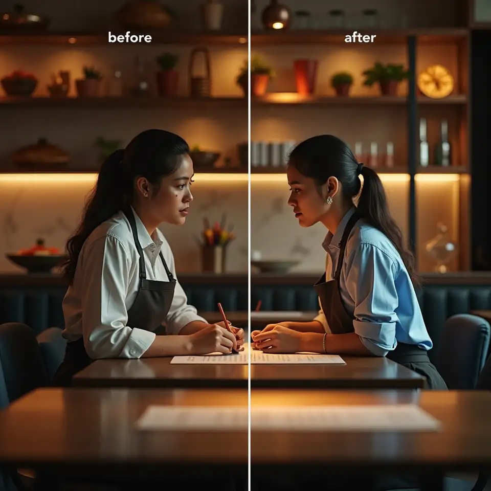
Side by side screenshots show a cluttered legacy menu next to a simplified version where redundant options are merged. Niageatveswi uses such contrasts to demonstrate that reducing noise can increase the visibility of genuinely different choices without limiting availability.

Responsive salience

Card sorting insights
Bringing behavioural insight into product choice
Option salience thinking keeps the focus on which products or tariffs feel possible, visible, and understandable at the point where people actually decide
Design comparison tables that support real trade offs
Comparison tables can inform or confuse depending on how they are structured. Niageatveswi focuses on which columns, labels, and highlights draw the eye first, then checks whether these elements correspond to genuinely important differences. The team encourages designs where a small set of clearly distinct options is compared on attributes that matter, rather than long grids where key details drown in uniform formatting.
Clarify which attributes matter most at a glance
Group options so natural comparisons emerge
Reduce redundant variants that blur distinctions
Use language that surfaces real constraints
Technical terms and internal category names may be accurate but opaque. Niageatveswi reviews copy for clarity, especially around eligibility, commitments, and limitations. Instead of burying these points in separate documents, the team helps integrate them into the main menu so that people see the shape of their decision, not just its headline.
Avoid jargon that hides meaning
Explain categories in everyday language
Highlight key conditions near the choice
Salience aware product and tariff menus
Making complex product and tariff menus easier to navigate without hiding important trade offs or conditions
“Customers were choosing the loudest plan, not the most suitable one.” That sentence, heard across sectors, captures the central challenge Niageatveswi tackles in product and tariff menus. When many options jostle for attention, limited cognitive bandwidth means only a subset receives serious consideration. Option salience in decision making becomes the invisible architect of behaviour. Niageatveswi steps into this architecture by analysing how order, grouping, labels, and highlights interact with human shortcuts. The goal is not to remove choice but to shape environments where meaningful alternatives stand out without overwhelming people. This involves mapping which options currently dominate, which are rarely noticed, and which are misunderstood. Using an internal method that blends qualitative review with simple experiments, Niageatveswi supports teams in reorganising menus so that relevance, not just visual volume, guides attention. The result is a calmer landscape where users can compare a handful of genuinely different paths rather than scan a blur of near duplicates.

How Niageatveswi reshapes crowded product landscapes
Product and tariff menus influence behaviour long before any detailed comparison begins, because people only compare what attention allows them to notice and hold in mind
Menu reviews
A B experiments
Reveal how structure shapes which products feel real
InsightProduct assortments often grow through incremental additions, leaving people to face long, uneven lists. Niageatveswi reviews these structures through a salience lens, identifying which options dominate simply because of placement or labelling. By regrouping and reordering with attention in mind, the team helps organisations present a manageable set of meaningful alternatives that better reflect real world needs and constraints.
Use naming that explains rather than merely sells
ClarityLabels such as “basic” or “premium” carry strong connotations that may not match actual differences. Niageatveswi examines how naming conventions influence perceived gaps between options, then suggests language that clarifies rather than exaggerates. The emphasis lies on explaining who each option suits, what it includes, and what trade offs it carries, so people can choose with fewer post decision surprises.
Align highlights with suitability and fairness
BalanceHighlighting a particular plan can be helpful when done transparently, but it can also crowd out better suited choices. Niageatveswi evaluates these emphasis patterns, testing whether highlighted options truly serve most users. When they do not, the team explores alternative cues, such as context based recommendations or clearer segmentation, to keep attention aligned with suitability instead of short term promotion.